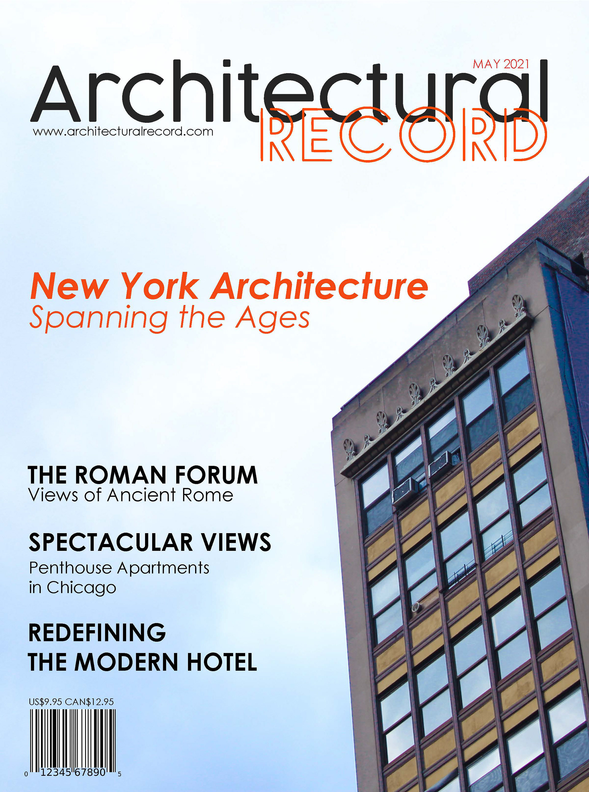
A modern type design for Architectural Record utilizing more design elements like the transparent shadow. This was a decision keeping in mind that not every photo used will lend to text in the same way. This was the 3rd cover I designed but ended up being the cover I liked the most mostly due to the colors and the original image.

Above, see original photo used. To the right, see two covers used for inspiration for this design.
The overlaying transparent shape was a really interesting way to break up the page and add another design element. This makes it more interesting to look at.
The use of a white transparent shape is very attractive to use on photography that may not be so friendly for text
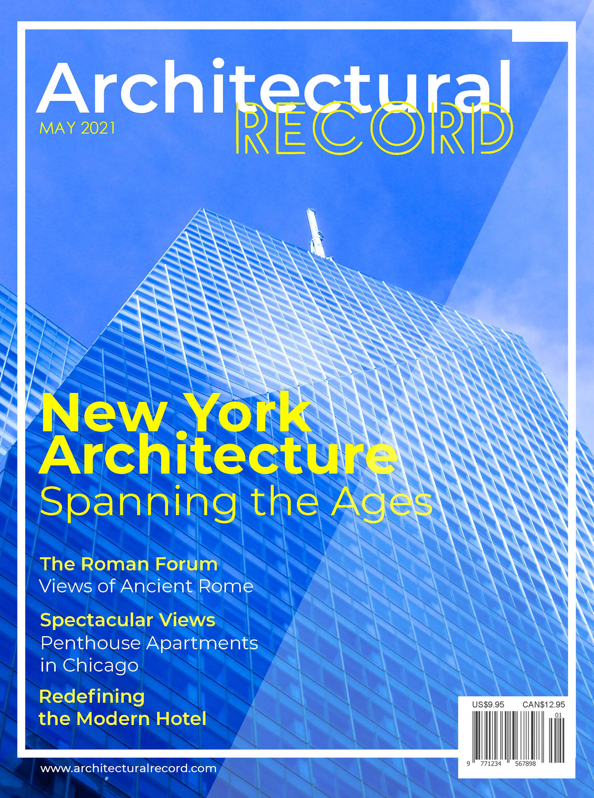
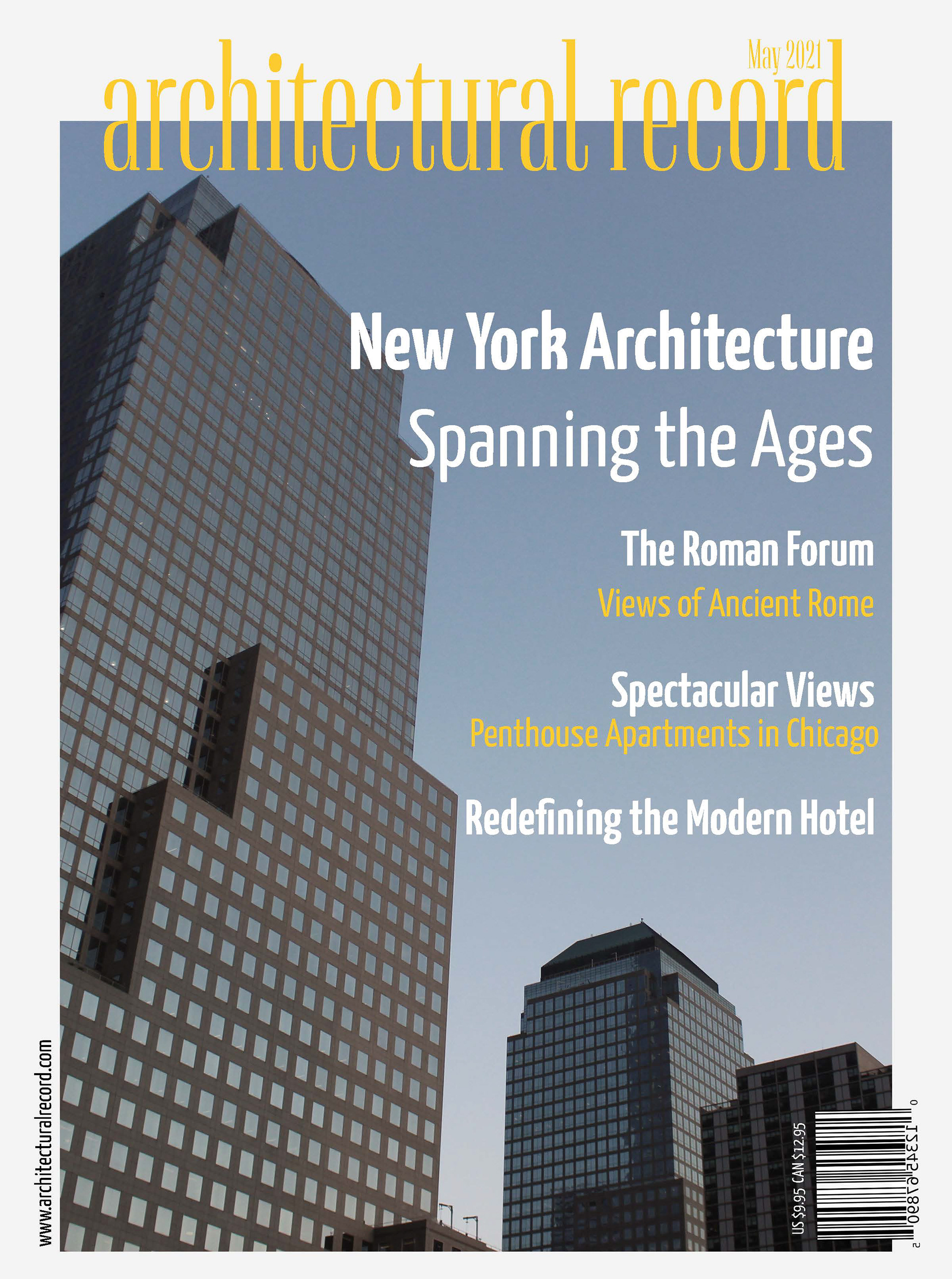
I designed this modern and sleek cover of Architectural Record. I got inspiration from a series of contemporary architecture magazines. I utilized the empty space to show off the architecture
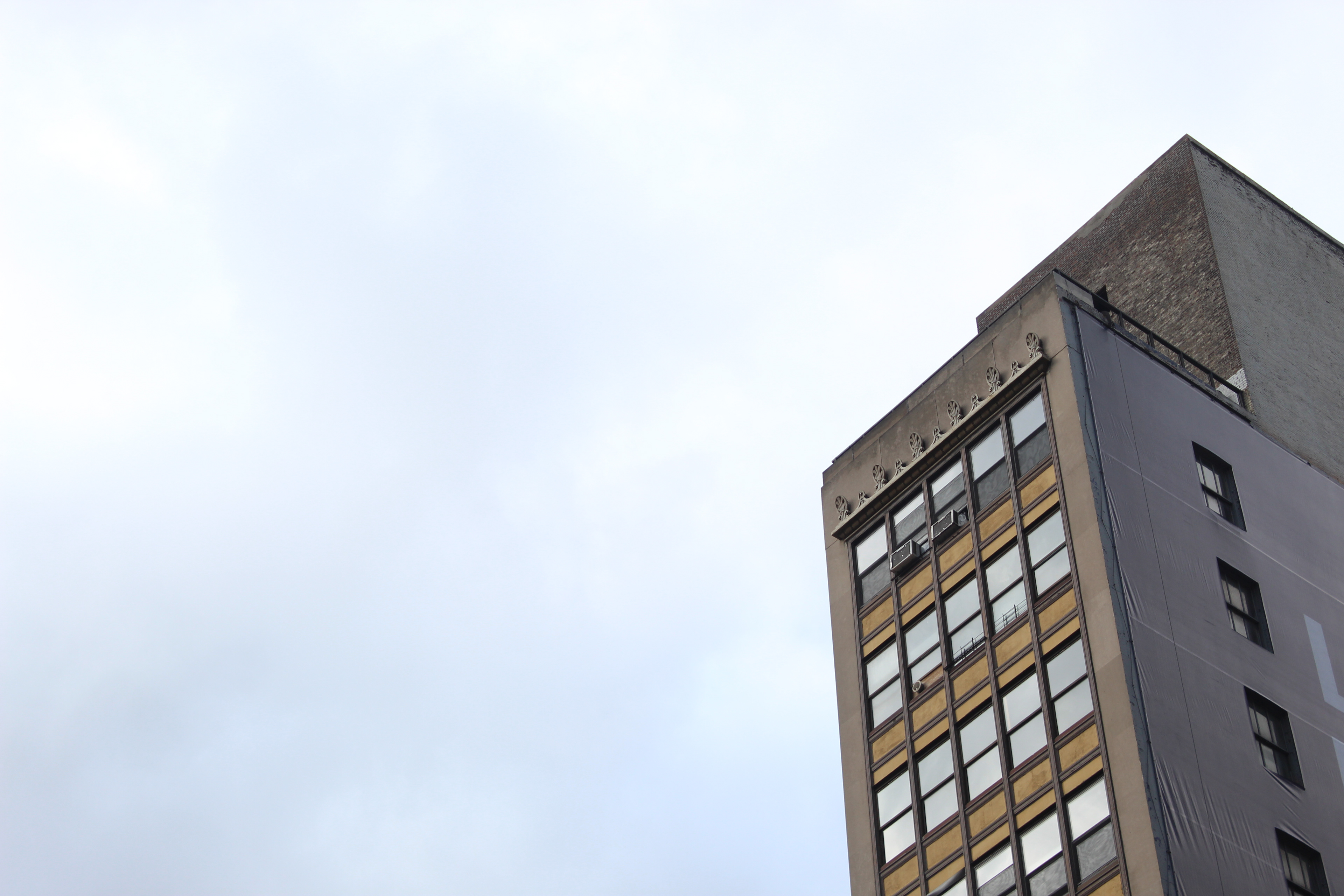
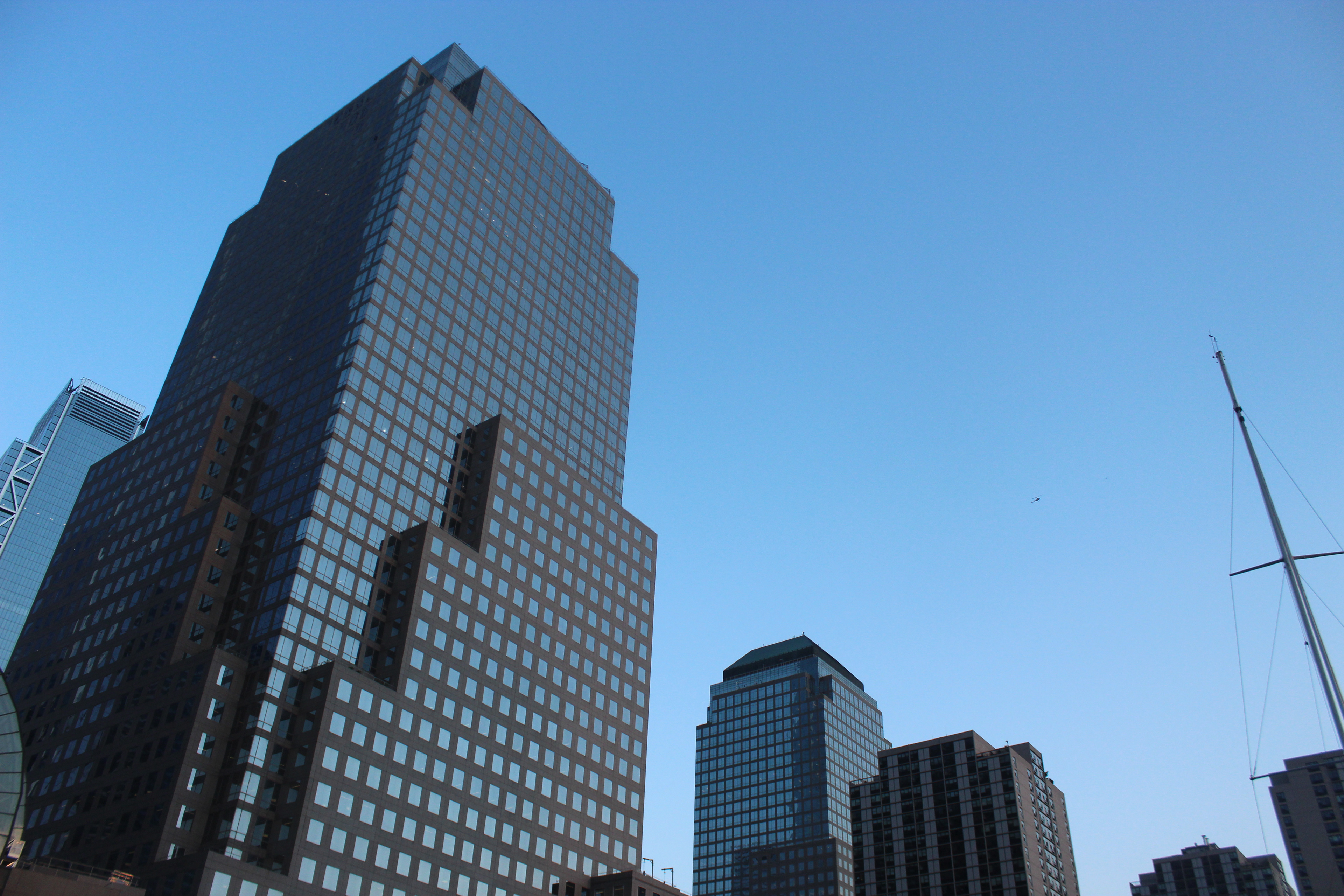
Above see the original photo used in the above design. On the right are two images used as inspiration for font choices and typography placement.
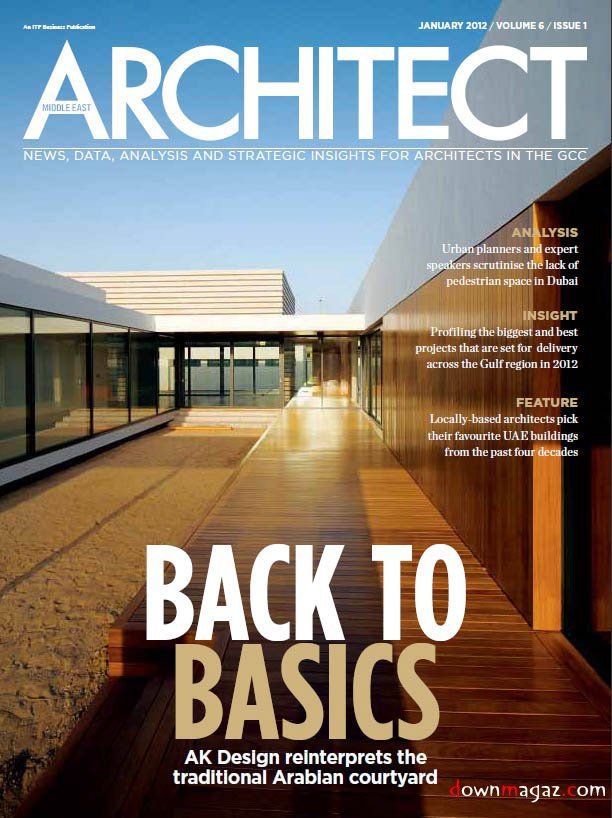
Inspiration for the font choice and typography treatment
Font inspiration
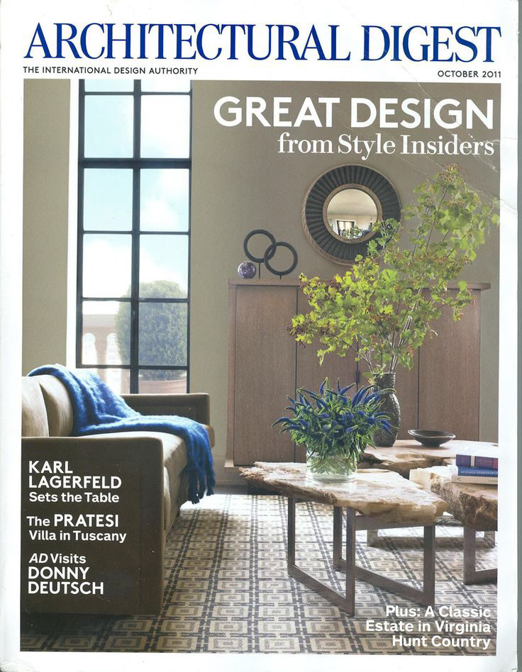
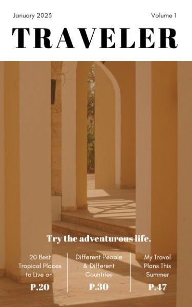
For this magazine cover assignment the inspiration was of the more classical designs of magazines such as Traveller or Architecture Digest. I tried to utilize the negative space in the photo while editing it to better match the creams and yellows I chose for this design.
This is the original photo used for the design above. On the right, I have 2 of the cover images that inspired the design above.